Redesigning A Client Management Portal
A comprehensive redesign of a client management portal, improving workflow efficiency and user experience for professional service teams.
Role
UX/UI Design
Categories
UX/UI Design, Product Strategy, B2B Software
Business
coeo
Timeline
3 months
Background
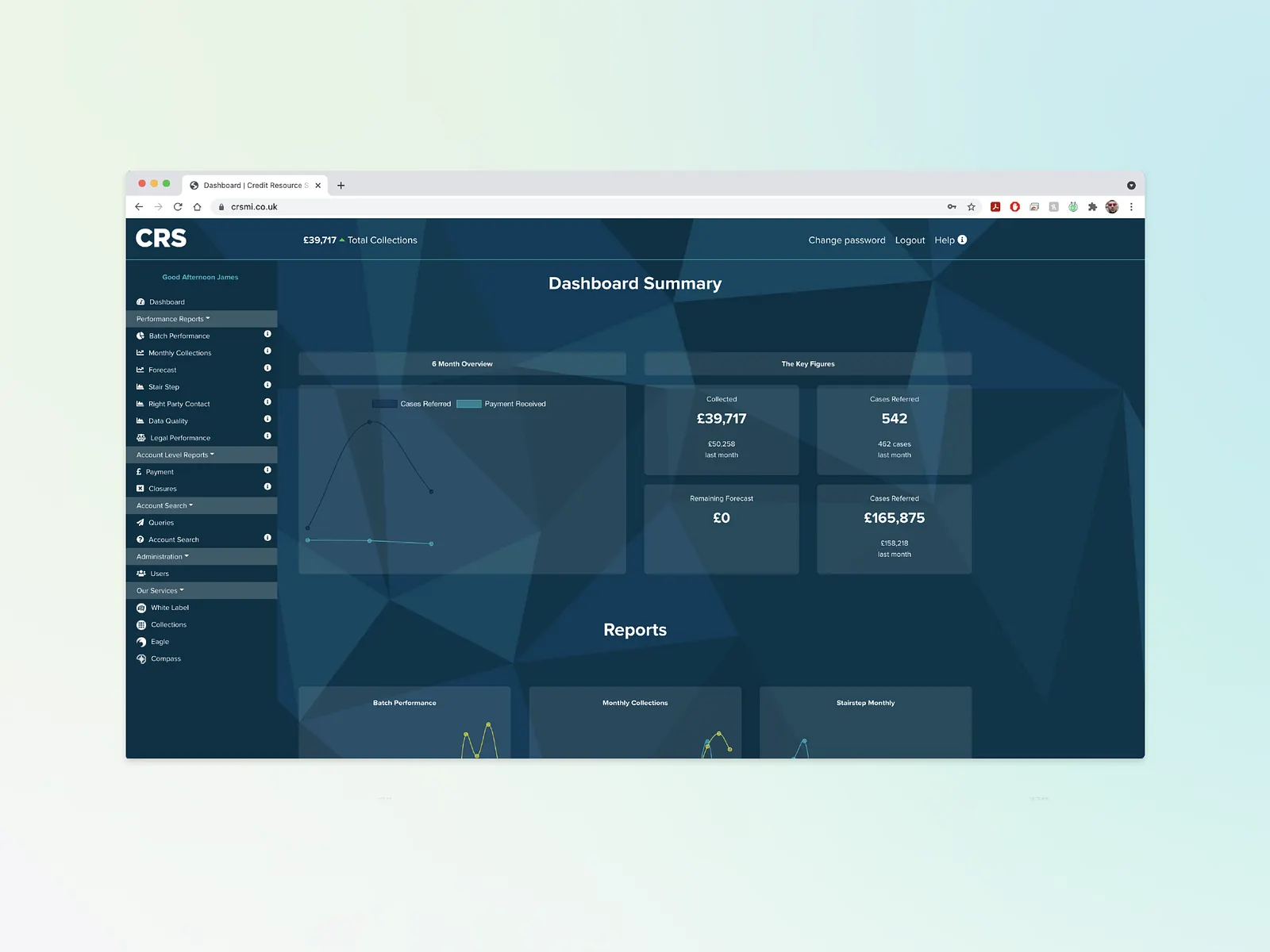
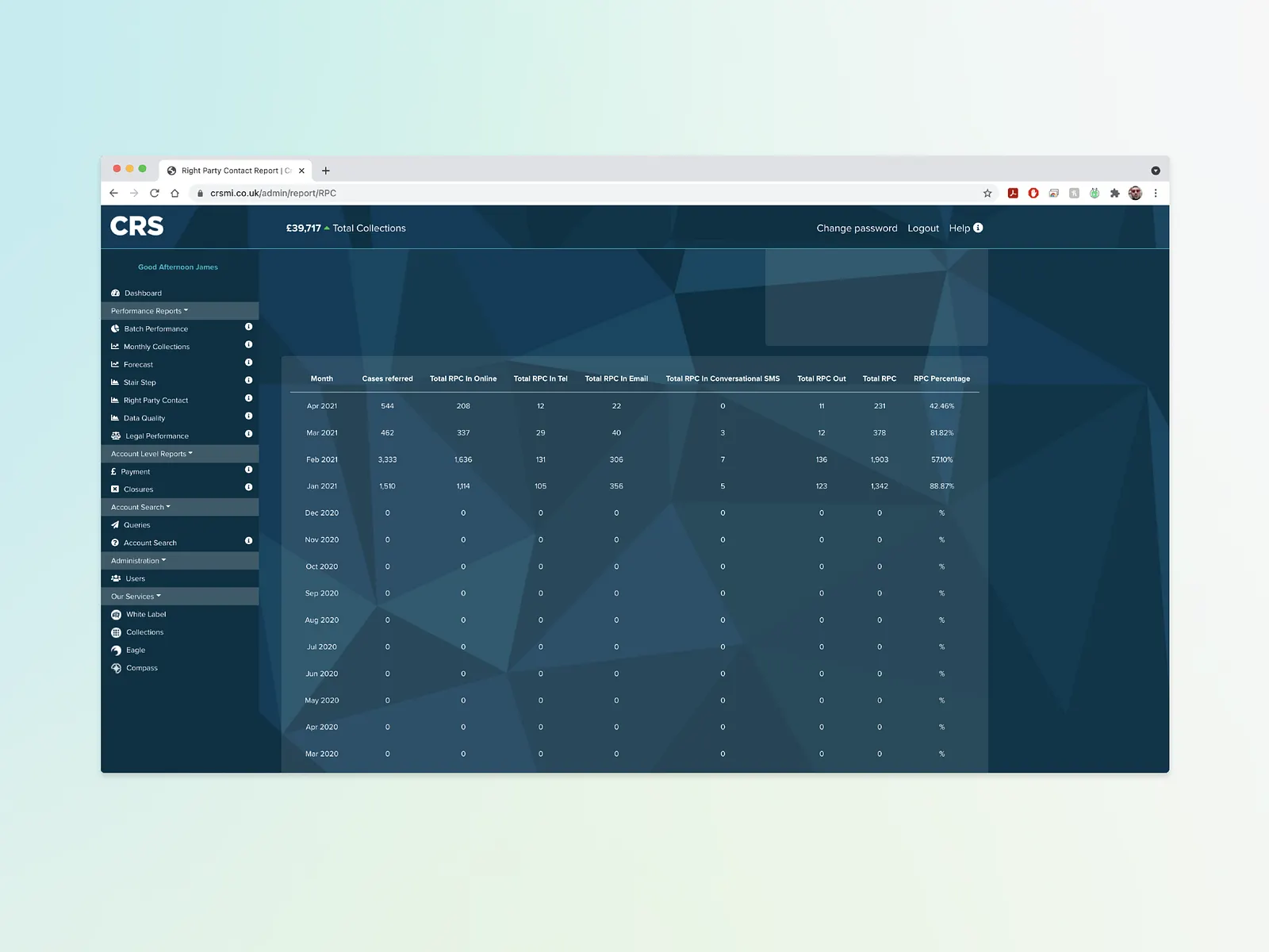
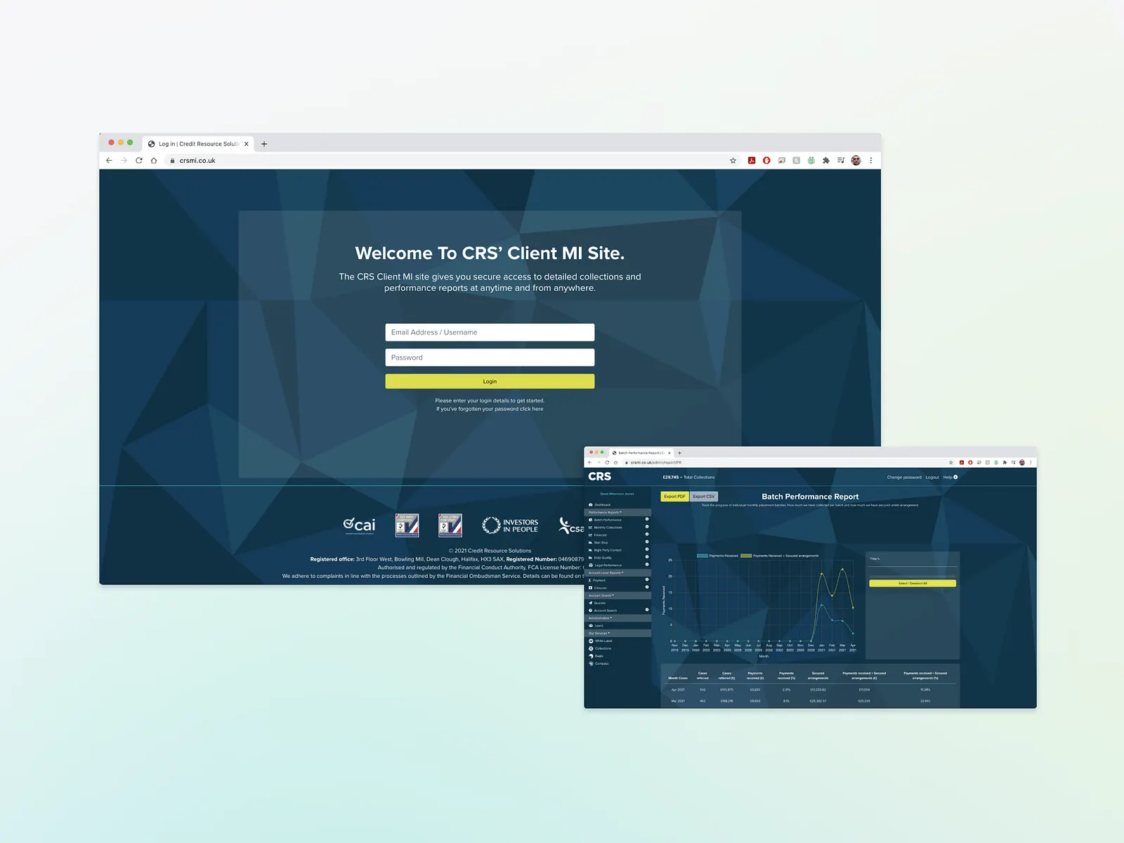
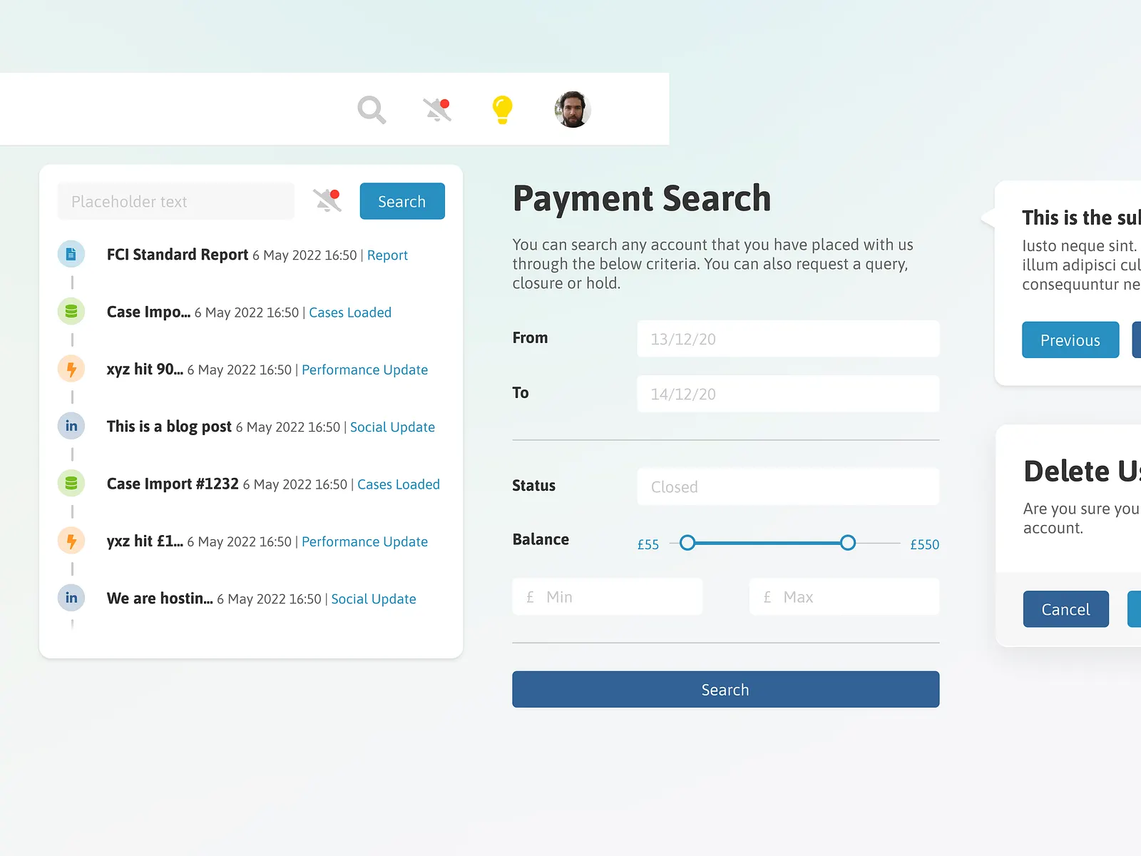
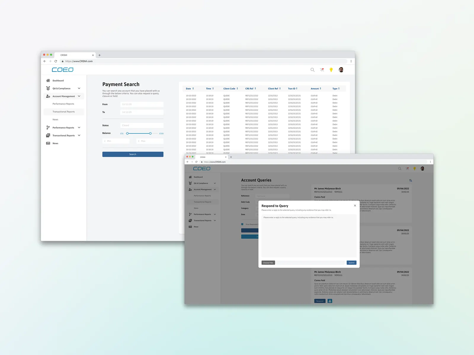
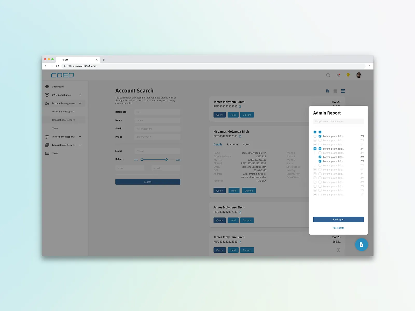
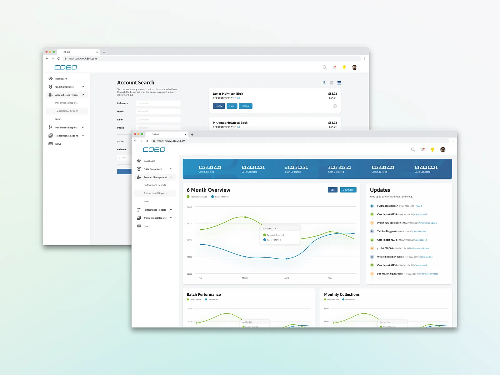
CRSMI is an internally built data management and reporting platform used by account managers and clients. The platform allows users to manipulate and interrogate data as they please, offering a standard set of reports which can then be expanded further down the line. (Similar to how google analytics works).
Key features include:
- Daily, weekly and monthly overviews with sorts and filters that can be presented as: Bar charts, Pie charts, Line graphs and tables.
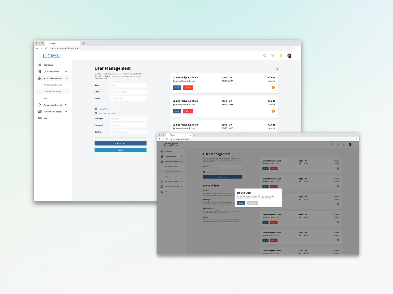
- Account management features including: opening and closing cases, editing details, accessing communication history, adding and responding to queries.
- The ability to upload and export data in a variety of file types.
The Problem
Having been used for a number of years, with features slowly being added throughout — the site has grown in capabilities but has lost consistency in its design and functionality. As features were added to the site, no thought was given to their layout and how they are accessed — leading to a menu filled with mismatched reports and capabilities. These non-standardised forms and page layouts make for a very disjointed experience and trying to use the site on a page that isn't 16:9 made for an even worse time.
Research & Discovery
Research Methods
User Interviews, Usability Testing, Analytics Review
Key Findings
Through our research, we discovered that account managers struggled with fragmented client information across multiple systems and found the client communication history difficult to navigate. The portal's information architecture needed significant improvement.
Key Insights
- 87% of users found the navigation confusing
- Users wanted better client data organization and search functionality
- Mobile usage was increasing but the experience wasn't optimized for field work
Process
Discovery
Conducted stakeholder interviews and analyzed existing user data to understand pain points and opportunities.
Research
Performed user interviews and usability testing to gather insights about user needs and pain points.
Design
Created wireframes, prototypes, and high-fidelity designs based on research findings and user feedback.
Testing
Conducted iterative testing sessions to validate design decisions and gather feedback for improvements.
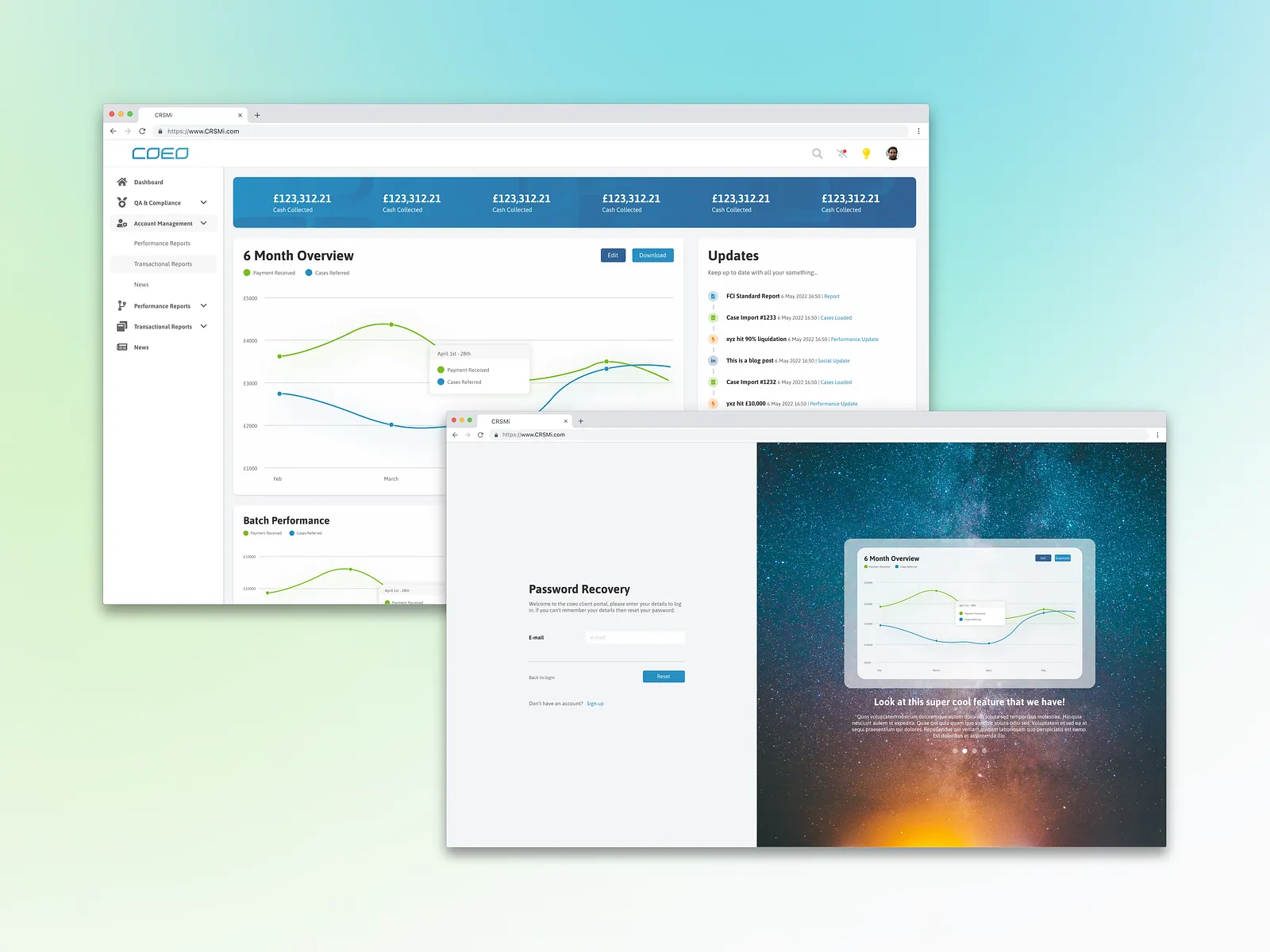
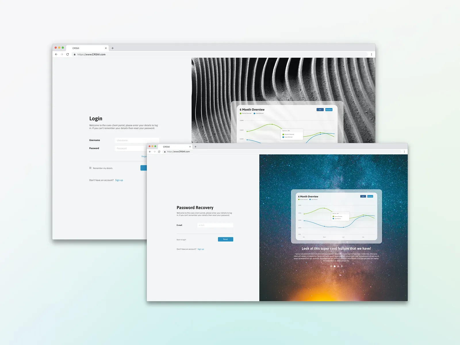
The Solution
I started by talking with key stakeholders in the business, such as account managers and the compliance team, before talking to select clients and sending out surveys to get feedback on what tools they use, what can be improved and what they struggle with. I combined this with heatmapping and user recordings to further refine the changes that were needed.
After I had a clearer scope of the project, I created a design system for the site (and other sites in the business) to use. This included colours, fonts, buttons, inputs, graphs, tables and layout conventions. I also worked closely with the development team to implement new features such as notifications, a quick onboarding feature and a dark mode. Before QAing and testing each feature before deployment.
Project Gallery
Impact & Results
Before
- task Completion Time
- 15 min avg
- user Satisfaction
- 65%
After
- task Completion Time
- 8 min avg
- user Satisfaction
- 92%