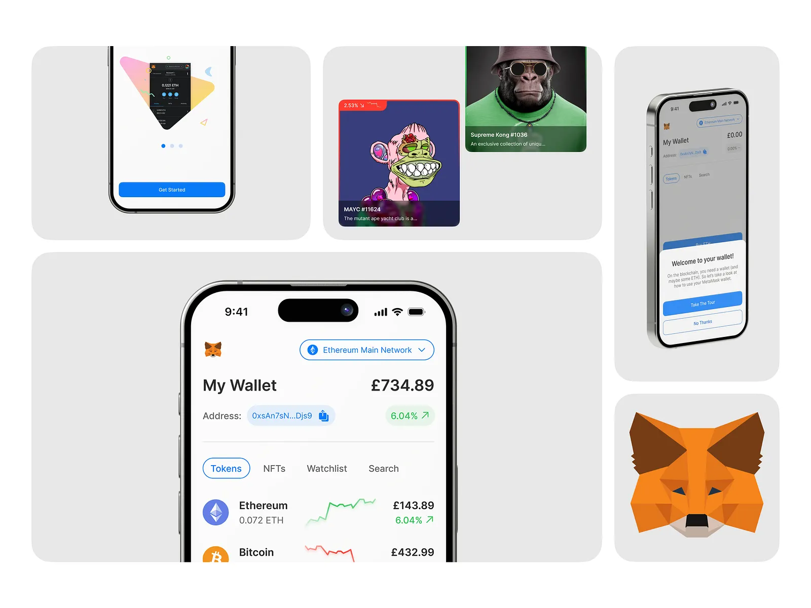
Improving MetaMask's Onboarding
A comprehensive redesign of MetaMask's mobile onboarding experience to reduce confusion and build trust for new cryptocurrency users.
Role
UX/UI Design
Categories
UX/UI Design, Mobile App, Fintech
Business
MetaMask
Timeline
1 afternoon
The Problem
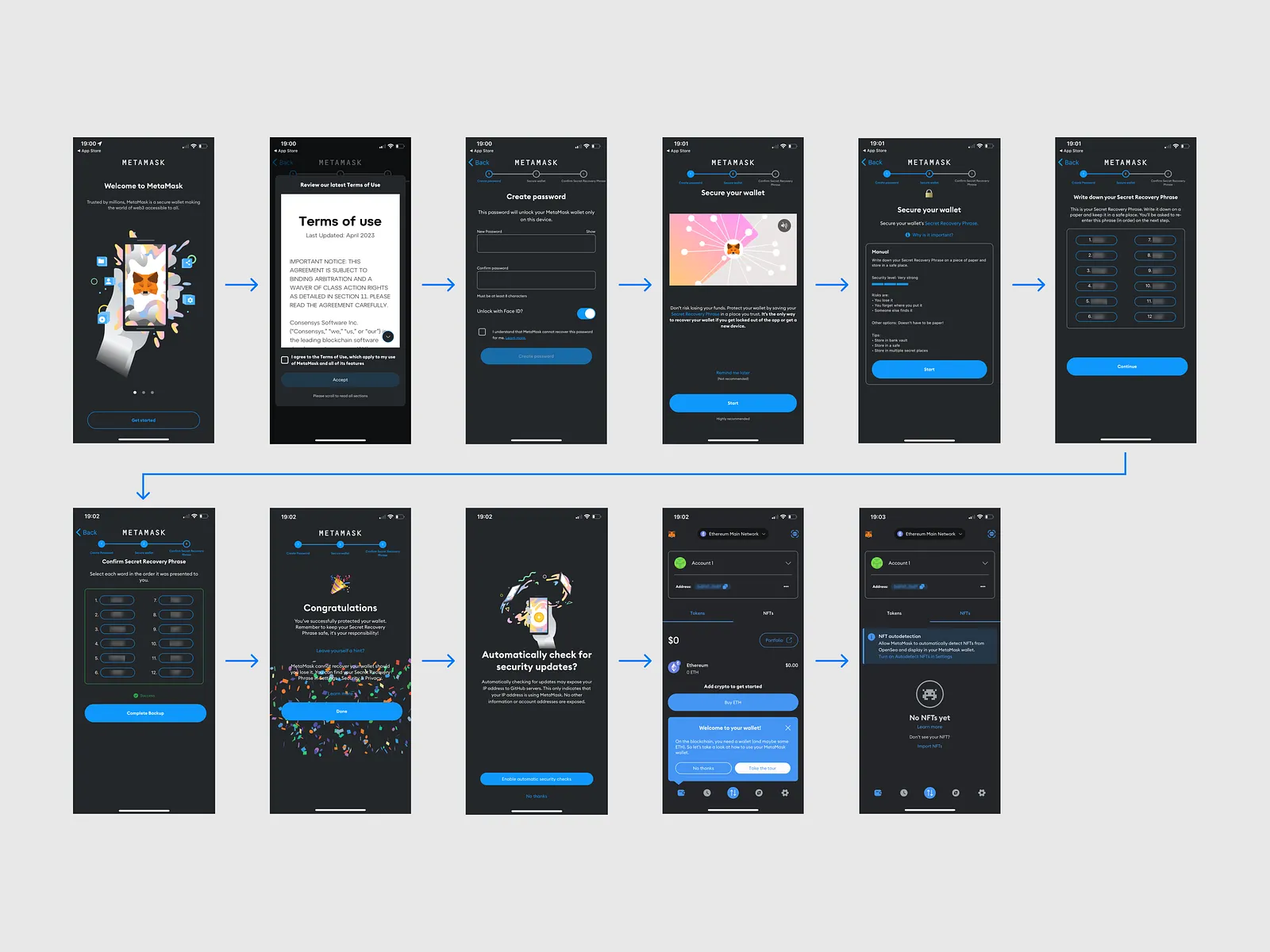
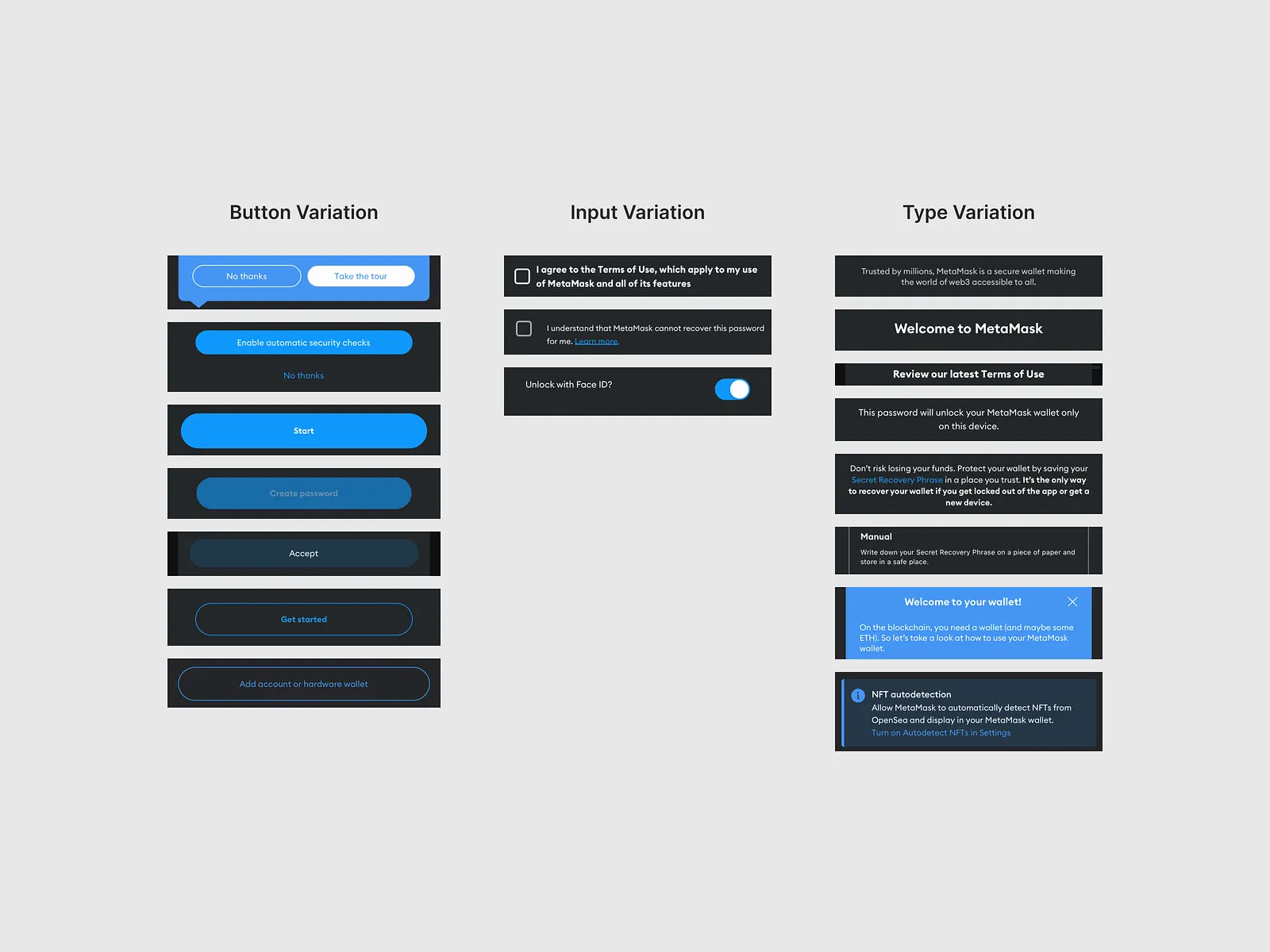
MetaMask has millions of users worldwide and a wide range of features that they can interact with. Upon opening the app for the first time, the user is walked through a short onboarding process in order to set up their wallet. For seasoned crypto enthusiasts this shouldn't be an issue, but for first timers this can be a little overwhelming or confusing. The process feels half hearted and unprofessional, with inconsistent styling of buttons, inputs and typography that reduces trust in the platform.
Research & Discovery
Research Methods
Heuristic Evaluation, Competitive Analysis, User Flow Analysis
Key Findings
The existing onboarding process had four main steps: accepting terms of use, creating a password, reviewing recovery phrase, and entering the recovery phrase. While brief, the information was presented in an inconsistent and confusing format with significant variation in styling of buttons, inputs, and typography.
Key Insights
- Inconsistent UI patterns reduced user trust
- Typography hierarchy was unclear across steps
- Button and input styling varied significantly
- Color scheme didn't inspire confidence for financial app
Process
Analysis
Conducted thorough analysis of the existing onboarding flow, identifying inconsistencies and trust issues in the current design.
Design System
Established clear typography hierarchy, consolidated input and button styling, and developed a trustworthy color scheme.
Redesign
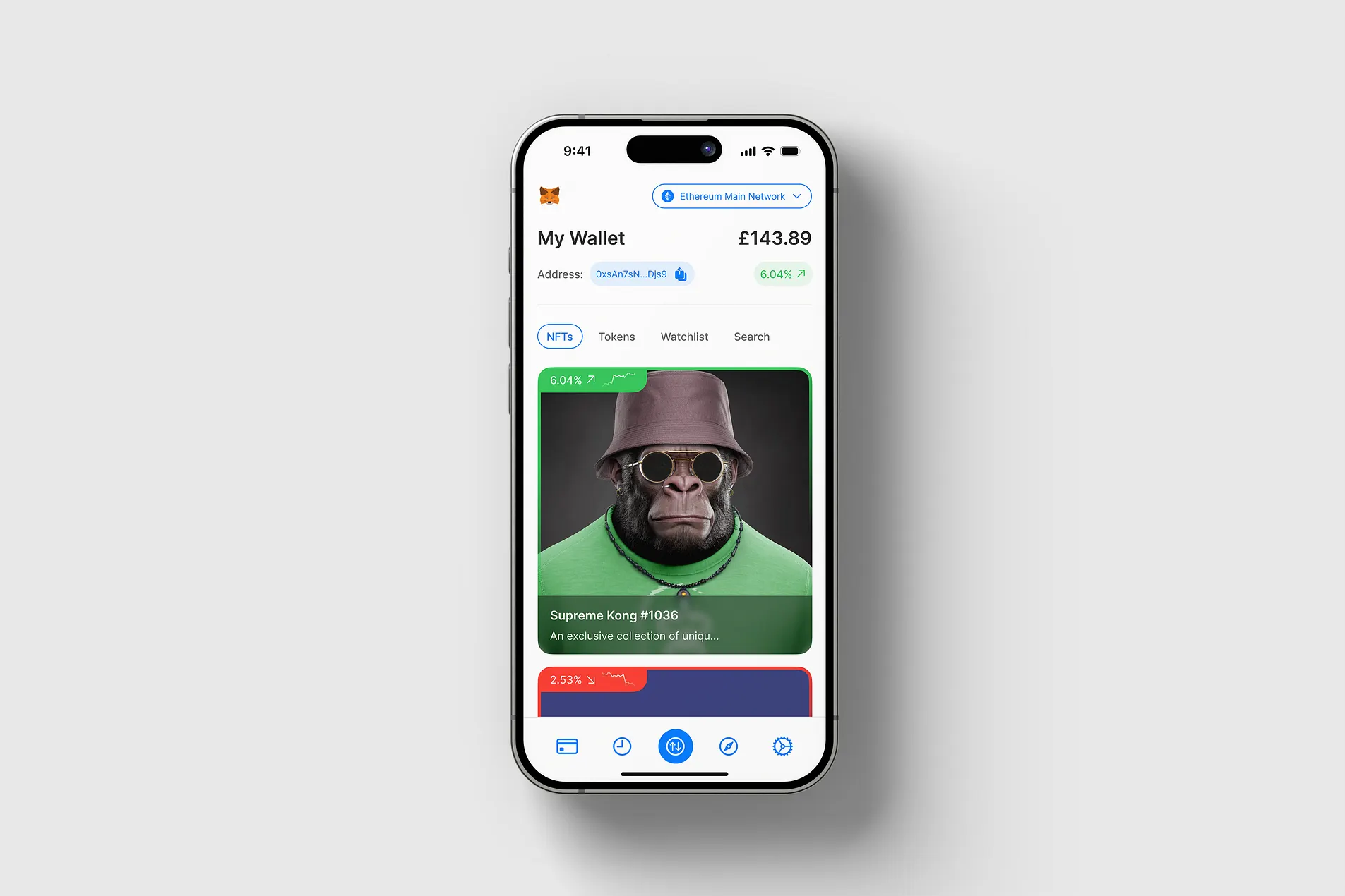
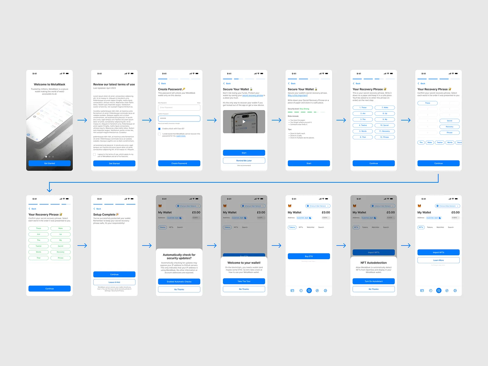
Applied the new design system across all onboarding steps to create a cohesive and professional experience.
Validation
Tested the redesigned flow to ensure improved clarity and trust-building throughout the onboarding process.
Project Gallery
The Solution
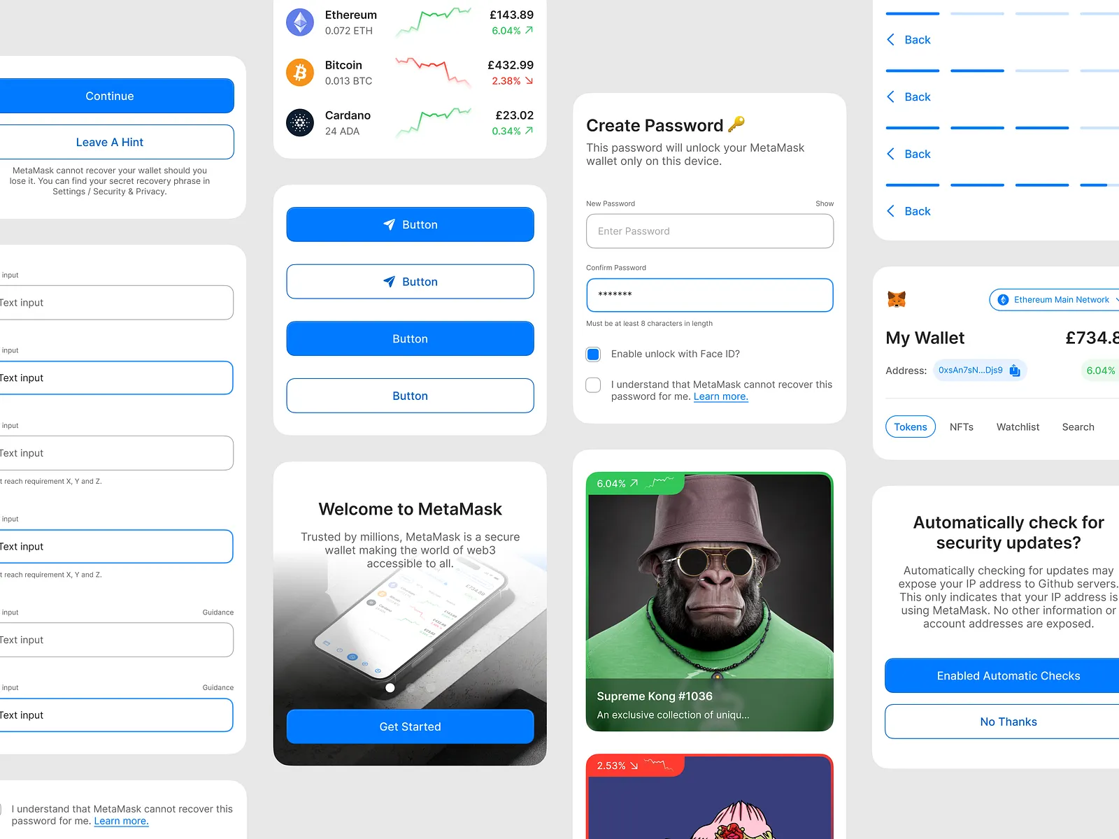
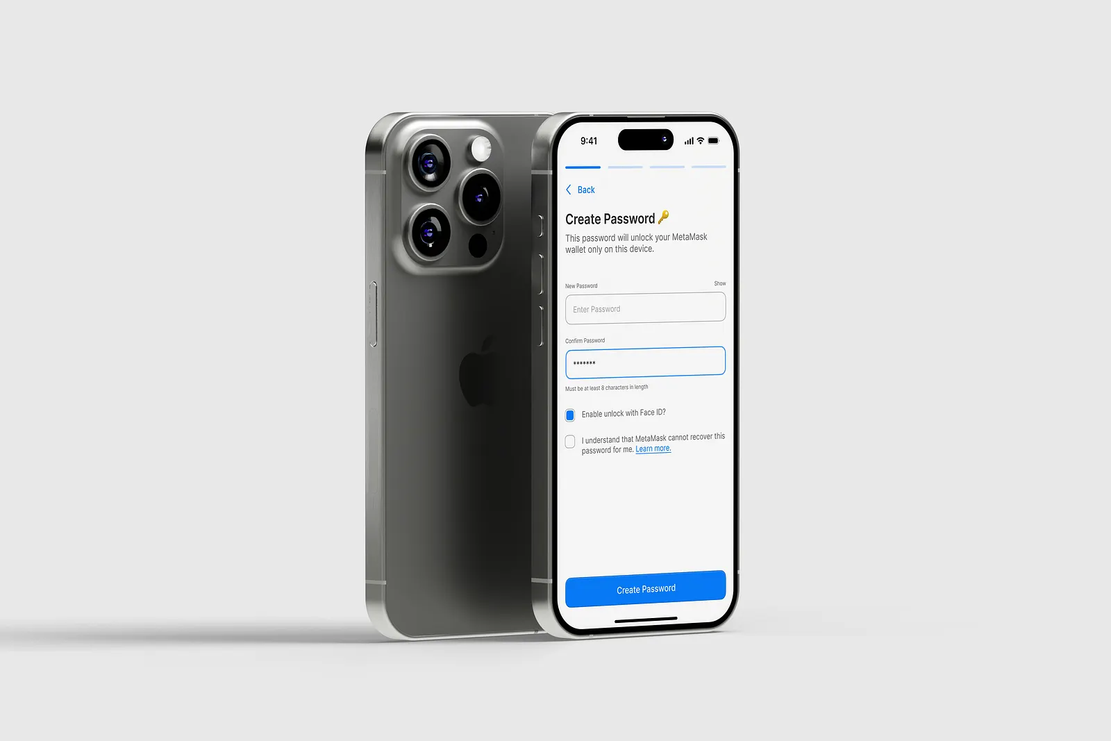
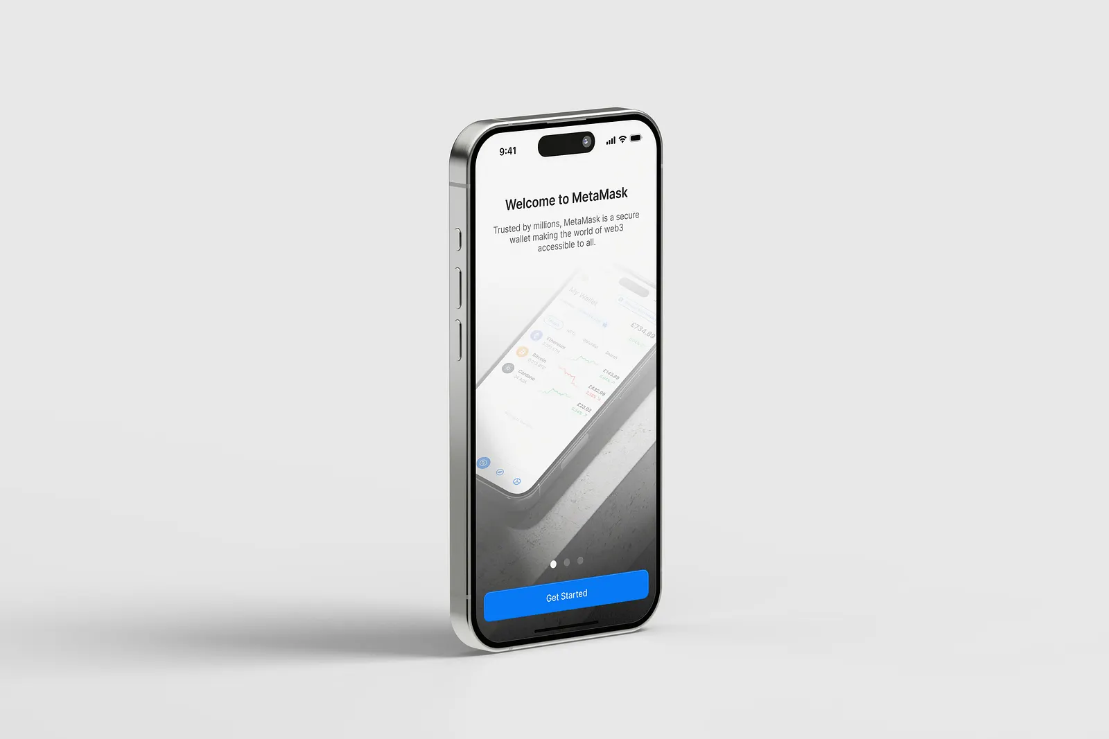
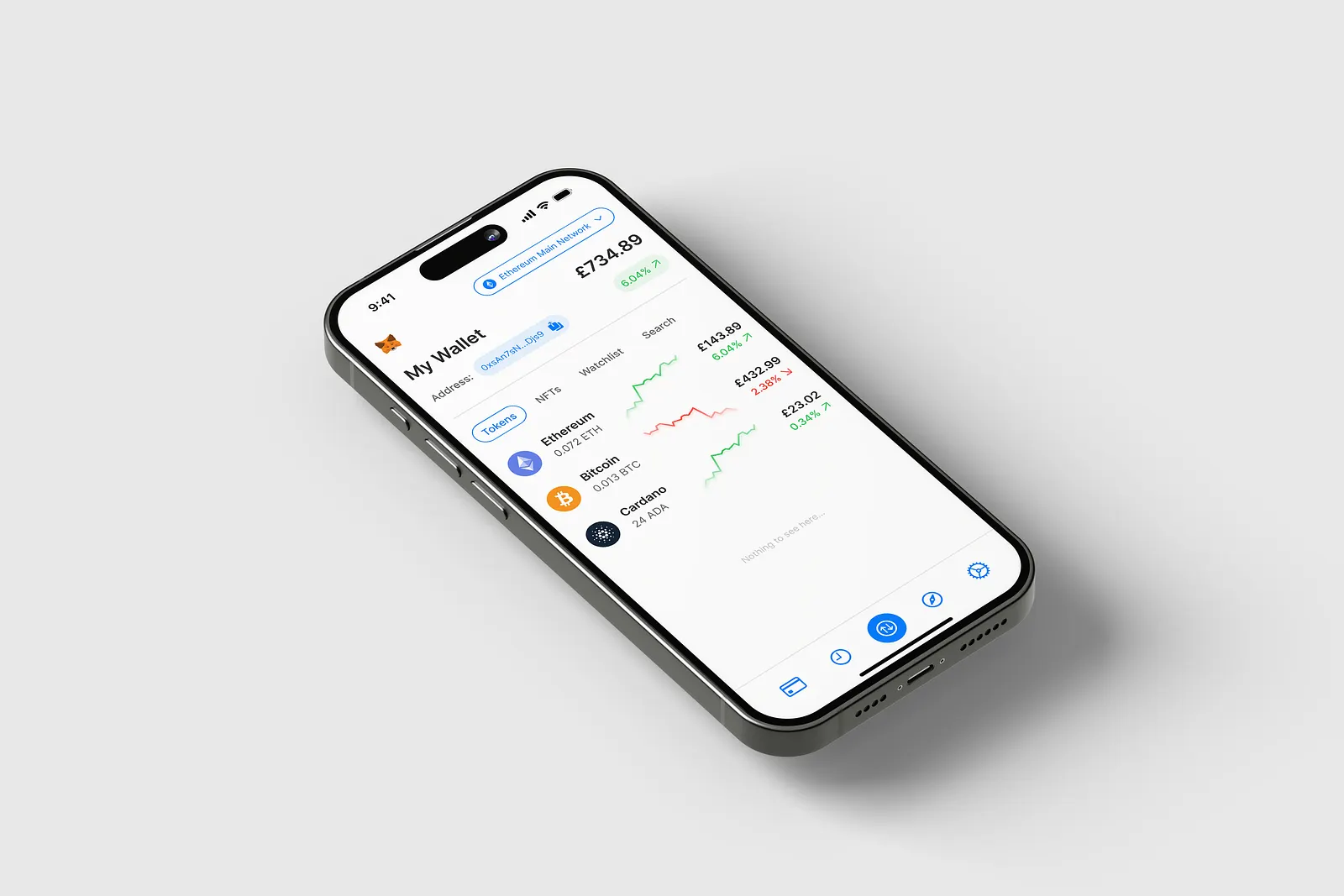
In order to help alleviate some of the issues mentioned above, I did the following:
- Set a clear type hierarchy.
- Consolidate the styling of inputs and buttons.
- Adjust the colour scheme to inspire trust.
